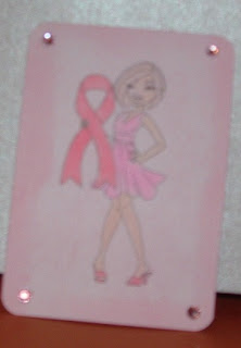
Do you ever have one of those times when you put alot of effort into something and it doesn't go quite right? This ATC had a lot of thinking go into it before I finally created it - I have to admit that I don't really like creating ATC's. This is possibly because my first attempts at them were heavily criticised and so I now lack the self confidence to tackle them.
I decided that I would do this one and was fairly pleased with the result - until I took the photograph. Grrr - the camera has decided it will not after many attempts take an in focus photo of this ATC. It worked perfectly okay when I took a photo of a card earlier in the day and perfectly fine last evening but tonight well here is the best of the photos:
Not too good huh? But the challenge closes in 2 hours and as it is 9.35pm I'm not going to get any better light before challenge closing. So, this will have to do. I'll try and see if I can get a better photo in daylight tomorrow and at least update my blog post if I do.
I have rounded the corners of my ATC. The background has been stippled using Distress Ink and a shaving brush. I think lightly inked around the edge of the ATC using one of the Tim Holtz tools and the same Distress Ink. The image has been coloured using copic markers - pink and E000. As the photo is so out of focus, it is probably hard to pick up the pink tinge of her hair.
The image is from Sassy Studio Designs and is called "Support a Cause"
I added some pink rhinestones to each of the rounded corners. I know that was one of the criticisms I had on my ATC's is that they are supposed to be flat but I felt it needed a bit of bling and couldn't find anything flat to achieve the look I wanted.
I'm sorry for the quality of the photograph but hope that you see the general idea of the ATC.

No comments:
Post a Comment